design

Looking for Light

In an effort to get out of my writing chair, I recently began taking an impressionist painting course with local artist, Mark Hierholzer. Each week I have joined two friends, and I have stood before a canvas, trying to paint light. Not color. Not scenes. Not objects. Light.

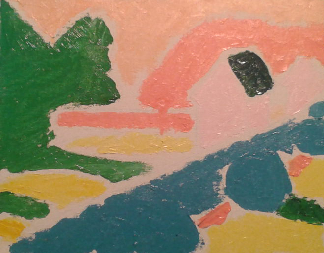
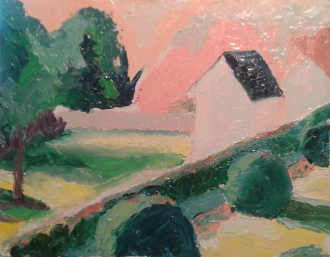
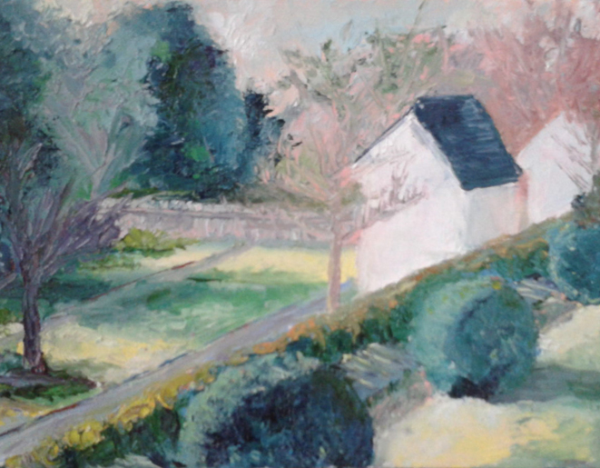
The approach for this type of impressionist painting goes something like this: (see the images below)

Step one: look for light in terms of shapes. When you squint, where are the tones or shadows melding together? Paint those–just four to six shapes total.

Step two: now where is the next layer of light? Or the next division of light and shadow? The sides of the shrubs? In the grass or trees? Paint that.

Step three: (which also might happen four or five more times), add detail lighting. The blue path, the foreground trees. Always searching for what the light is doing. Where it is. Where it isn’t.

While my painting skills have a long way to go, I put the emphasis on the word light, because after each three hour class, what I end up feeling is light. All my hours of sitting and writing and worry slide away. We listen to classical music. Drink wine or coffee. Laugh. And we focus on the light. In life, I think I will choose to make this my focus, too. And so, painting leaves a great impression.

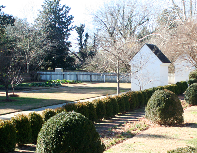
(Sorry, could not resist the pun. Nor could I resist the subject of my first landscape painting. These are the necessaries–outhouses–at the Wythe House in Williamsburg.)

Wythe_Privies1
The original photo I took.
Step One. Blocks of Light.
Step Two: Using light to define shapes.
Step Four (through however many it takes): Add more lighting details in layer upon layer until done.


Guest Post: The Sweet Lindy Dale

My guest blogger today comes all the way from Australia! Lindy Dale is an author of Chick Lit and paranormal romance (wow). After writing books for ten years, she recently went through a brand redevelopment for her books and author platform. So grab some coffee or chocolate, curl up and read on…

LindyDale

When I first started out, I had a homemade cover and a book. No website, no blog, Facebook Page or Twitter accounts. It didn’t take long for me to realize that if I wanted to be noticed, I was going to have to do something more. If I wanted to be regarded as a professional I had to have a professional look– not some tacky thing that screamed “DIY”. That’s where branding came in.

The first step was to define myself.  Okay. I’m a Chick Lit and Women’s Fiction (WF) author. My Chick Lit runs to the humorous side and my WF is often sadder. The common thread is love. Always love.

Next, I created a logo with a cute, fun caricature. You can see it on my Facebook page. It defines the type of book I write–fun, easy to read, happy endings. I carried this over to my website and blog.  I also changed my pen name from L.A. Dale to Lindy Dale to strengthen the Chick Lit theme–you don’t hear of many CL authors using initials. It’s a more personal, friendly genre.

Then late last year, I engaged a cover designer to redesign my covers to give them a cohesive look. The font and style will be the same, though there will be differences between the Chick Lit and WF that will instantly tell the reader what type of book they’re going to read.

The last stage has been the blog and this is a work in progress.  Instead of the hit and miss process I had before, it now has a structure with regular posts on topics chosen by my readers. It comes out weekly and is backed up by a newsletter of exclusive content only given to subscribers.

So what about you? Have you ever considered branding yourself?

You can find Lindy on her website, her Facebook and Twitter under @LA_DALE. Below is a screen snapshot of her oh so cute website redesign.

LADaleNet


Guest Post: Kelly of Austen Hill

k2_200

Today’s fabulous guest is the lovely Kelly Fitzgerald, founder and creative voice behind the lifestyle blog Austen Hill, where she writes about fashion, design, travel, food and more. She created the site as an outlet to share things that inspire her, and she’s come to chat about how it all started. Kelly…

Take a Chance on Yourself
When I began Austen Hill I had no idea how hard it would be, but I had felt for some time that there was a burgeoning designer inside of me just waiting to get out. What did I want to design? I had no clue. I just knew I had all of this creative energy and I needed a way to channel it. Blogging seemed like a wonderful way to explore things that I loved, and also write a bit.

Step 1: What do I do well?
A lot of my friends have asked me to help them plan parties, re-decorate rooms, or pick out the perfect shade of gray. I soon realized I had a knack for designing, and I was never asked to run the final length of a relay race. So I can’t run very fast, but I can design the heck out of a tablescape.

Step 2: Find my style.
For those of you in the marketing world, you know brand is everything. Articulating my brand, or style, consistently ensures that my readers immediately identify Austen Hill. What is my style and why does it matter? I created my Pinterest Board  to get started and I always come back to it for inspiration and continuity.

Step 3: Drink a lot of wine!
It can be scary putting yourself out there. What if people don’t like what I’m doing? Through this experience I’ve learned to trust my design instincts and go for it. I took a chance on being myself and I’m so happy I did.

Check out her blog, AustenHill! Or visit the blog’s Facebook Page. Starting Monday, 14th, AustenHill will be holding a week-long give-away in conjunction with moi! If you like Paris and free books, this contest will be for you.

For her day job, Kelly travels the country working on health policy issues, but calls Richmond’s historic Church Hill home, where she lives with her dog Miss Austen. Below are a couple of her lovely pics from her blog, including an appetizer set-up in her living room, and a mood board she put together inspired by Les Misérable.

apps_Kellys copyLesMis


Posted in Blog | Comments Off on Guest Post: Kelly of Austen Hill

Bonjour 40 – Le livre est arrivé!

Bonjour 40: A Paris Travel Log, the print version, is now available on Amazon!! Oh la la!

So many readers asked for it and it’s finally here. After the success of the eBook and receiving an eLit award, I went out to find an agent and a traditional publisher. But then I got to wondering what kind of book they would make. What would it look like? What would the design feel like compared to my trip? I’m a professional designer, and we like things just so. After some searching and a lot of encouragement, I eventually gave in… no, stepped up, and said, “Karen, you can do this.”

So I combed through the thousands of photos from the trip, and added in some new text. Then I went at it. Now it is 132 full-color pages, 8.5×8.5, with over 100 images. It feels more like a photo journal and a pictorial journey through Paris, but it still has my stories about a strange pillow and Bandit the dog.

If you loved the eBook, I hope the print version will be on your gift list–for yourself and others. Joyeux Noël.

For those who want to know how I produced the book, my process included:

~ InDesign for the page layout of the interior and cover.
~ Photoshop to crop, resize and color correct all 109 images.
~ Worked with April Michelle Davis to edit the copy in the new layout.
~ Opened an account through Createspace (Amazon’s print self-publishing).
~ Submitted a PDF of my files and they sent me a physical proof.
~ Based on the size and page numbers, Createspace helped me set pricing.
~ Approve it all, and wait 5-7 days for it to hit Amazon.

A few of the inside pages are below. To see more, you can “Look inside” on Amazon.

Bonjour 40 on Amazon

Bonjour 40 Paris Travel


I’ve done it. You probably have, too. I’ve Google searched my own name to see what comes up. This week, I searched Amazon under Bonjour 40: A Paris Travel log. Typing in various words and phrases from the title, I wanted to see what other items might come up. I found a plethora of fun things from teapots to paintings. So, I gathered of few of them to share.

In just a few days, there will also be one more item. A print version of Bonjour 40! Readers who bought the e-book containing nearly 40 images, begged for more. Fans without e-readers begged for print. Those who love to armchair travel holding something tangible, asked when they could get their hands on it. So, here’s the gift I’ve personally designed to bring to all of you.

With over 100 photos, plus a few extra tid-bits, this new expanded version, is an 8.5×8.5, full-color, paperback walk through the streets, markets and delights of Paris. It still has all the content and stories of the original travel log, but now, so much more.

I’m reviewing the proofs now, so stay tuned for the big launch just in time for the holidays! In the meantime, you can click on the image above and find other ways to hold Paris in your hands (my favorite is the My Duckie Paris, black bathtub rubber duckie.)

My proofing copy of Bonjour 40. It’s 132 pages of over 100 full-color photos, journal entries and more! Coming soon to Amazon!

Lucy Inside and Out

In branding I often speak with clients about perception. How they are seen by others is probably how they really are. So if they want to put out a certain type of image, then it’s important to be that image. Not become. Be.

However, clients, like people, aren’t just one thing. They’re complex. In fact, they’re like Lucille Ball. Lucy was a stunning movie star who was astute and said brilliant things. But then she could turn all ham and cheese and sometimes stuffed her mouth with the wildest things.

Lucy’s lesson is to be yourself. Who you are both inside and out. Because what you hope you are and what you probably are, are perceived by everyone. And perception is reality. For laughs, and as an example, I return to Lucille Ball. Using public domain images of Lucy, I’ve comprised a photo series of who I think I am, and how I think I’m perceived. So in a nutshell (my nutshell), I am both these things.

Me at work:

My relationship:

My friendships:

What I look like in costumes:

My confidence in new adventures:

If I were a superhero:

My movie star quality:

Got Creative Milk?

What does a dairy farm have to do with the creative process? Nothing. And everything.

I recently toured the family farm of fellow designer, Candace Monaghan. Beaver Dam Farm has about 120 dairy cows. Naturally, there are boy cows who are also born, bred and sold, but the farm primarily produces milk. We wandered over her family’s property hearing stories about how Candace and her sister grew up crawling around inside of hay-lofts. They rose early along with the sun over rolling hills tinted with fall gold. They worked alongside animals and nature. It’s a magical American youth that is lost to most of us. There’s even a goat, Fred, who was simply dropped off on their property one night. He now happily follows workers around like the family dog.

While the tour was a social visit in many ways, my creative process is often enriched when I experience things that have nothing to do with what I do. I saw colors and a view I rarely see. I smelled things both beautiful (air, hay) and foul (manure) that educated my sense of smell.  I saw how this life influenced Candace, and it explains why her photography is so stunning. Her eyes see things through unpolluted, beautiful air.

It’s important to step away from what we do, so we might find new stories and new perspectives. Or, as Monty Python says, “…and now for something completely different.” As for Fred, he just might make it into my book.

First Friday: Sandy Fakes

At the beginning of this week, the world watched and waited for glimpses of what was happening as horrible Hurricane Sandy swept into New York. We had plenty of warning, and consequently, many designers with Photoshop had plenty of time on their hands. In light of what happened, they are silly now, but I wonder if perhaps some of these images didn’t help those of us who could do nothing but wait.

Did the fake photos allow you to feel compassion for what was happening by providing visuals that made you then search out real ones? Did some of them give you a silly moment in the face of worrying and concern. For me, yes, to both.

I give you a gallery of the Photoshop fakes. The best of which I believe is Chris Henson’s. A designer and copywriter in Virginia, he reworked an image he had posted earlier in the day–a trampoline stuck on wires. I think it’s the best because it was obviously far from reality, but it gave his friends a break we needed. Then we all went back to waiting.

After having now seen all the real images, they are in fact more dramatic than the fakes. We’re stunned. I hope you’ll be spurred into action. Our fellow humans need us. And so do many pets. 

If you took the time to read this post or look at the pictures, I hope you’ll spend five minutes more to send help.  NBC has posted this ‘How To Help After Sandy’ list.


The Art of the Tarot

That’s me on the left receiving my reading from Jan Thomas. She jokingly laughed at the idea of putting a “Tarot Reader In” sign in her living room window. Strange how that lighting turned out in this photo. – Photo by Karen Rankin

BOO! In honor of Halloween, a very tiny glimpse into Tarot cards. I was recently at a book club, and a few of us unexpectedly received a reading by the host, Jan Thomas. My first ever. She asked me to provide a specific topic or concern, and she dealt the cards and told the tale she saw. Two things have haunted me most.

First, the artistry. Tarot cards date back to the fifteenth century, and many decks are stunning. Imagery is often filled with old world or art nouveau styling, and for illustrators of sci-fi or fantasy, I imagine they’ll be charmed. (That’s not to say there aren’t modern versions, like these featuring the Simpsons.) Jan’s cards are a Rider Waite Smith deck. “First published in 1908… there are several editions and I was using the one call Universal (has to do with the re-coloring of the deck).”

Secondly, a couple of the cards she pulled were a relief. One was The Knight of Pentacles (see image below). This card has layered meanings, but she described it as a knight who is serious, on solid ground, and holding a coin, so the dreams he looks out over, although a bit away, will be a fruitful reality. The last card she revealed, on the bottom of the deck, was death. That’s good news because it’s the furthest away from my dream, and me personally. Whew!

So will my reading turn out to be a trick, or a treat? I guess I shall have to “stay tuned” to find out. Muwahahaha.

Click here to download Jan’s reading of my cards corresponding to the picture below.

A shot of the cards that were pulled for me with the two cards I mentioned circled. Go ahead, Tarot readers, tell me what else yee kin see in ’em….. – Photo by Kelly Fitzgerald

Posted in Blog | Comments Off on The Art of the Tarot

Throwing Back the (Book) Covers

Confession: I have not read any of the Fifty Shades books. Part of my hesitation is because I have judged those books by the covers. To me, those sleek, modern covers quite simply lack thoughtful or artful design.

The all-grey palette and the simplified layout work for the small icons we see online. However, too much space at the top isn’t balanced with the space at the bottom, so the “#1 Bestseller” line lies too close to the edge of the book. The dull and forgetful Courier-esque type is squeezed tightly against images that hog the layout and are rendered with some of the worst drop shadows in history.

Take a look at those handcuffs (an image in contrast with the word “freed” in the title). How does light coming from the right cast a shadow to the right? It should be on the left. The shadow is also so wide the heavy metal cuffs are actually floating. Look at any object on your desk to see what I mean.

What does design say before you read? Poor layout = poor writing. Thoughtful layout = thoughtful read. Maybe I’m wrong and the covers have drawn in readers, but I suspect sales aren’t handcuffed to the design. I think sales are up because people historically like a scandalous tale, and they are seeing their married friends come into work with smiles on their faces.

Based on the below book covers, I think I’ll pass on the shades and pick up an old copy of Lady Chatterley’s Lover instead.

This cover design balances white space, highlights the title, and the color in the Signet logo matches the woman’s hair so the eye is drawn down across the book title and author’s name.
Book covers were once considered art. Lucy McClaughlan did this illustrated design. Her other work is in private collections and the Victoria and Albert Museum, she’s rendered murals on buildings, and was listed in “The 100 Leading Figures in Urban Art.” (I wonder what Doris Lessing would think of dear James?)

© 2024 Karen A. Chase. Collection of data from this website is GDPR compliant, and any information you may have about data collection can be found in our privacy policy.