design

First Friday: London Olympic Art

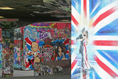
Graffiti artists abound in London. Here, an image taken on the South bank of the Thames in an area where graffiti is allowed, was done for the wedding of Prince William and Kate.

London likes to dress up for special occasions. In honor of the 2012 Summer Olympics, my First Friday is dedicated to some of the artistic endeavors inspired by the games. (I will not give praise to the disastrous 2012 logo and mascots only McDonald’s could love.)

Dress
Could the styles of uniforms for the athletes be any more vogue? Stella McCartney designed the stunning UK team’s Adidas gear, making me wish I biked for Britain. (Meanwhile, Ralph Lauren designed the clothes for the USA team… but they were made in China. Doh!)

Hat
Londoners love hats, so the Mayor dressed up a few of the city’s iconic statues with designer creations that play homage to the flag and even to SPAM (Spam, Eggs, Spam and Spam).

Olympic Park Art
Aside from the stadium which transformed the historically grubby east end of London, the Olympic Park is home to one-of-a-kind art installations commissioned for the park, including a giant mirrored display of the word RUN. See more in the official Art in the Park brochure.

Graffiti
London is among the best in the world for beautiful street art, and its graffiti artists have stepped it up for the Olympics, like this perfect placement high-jumper by Banksey. Sadly, the International Olympic Committee and the British Transport Police (BTP) have been fiercely removing graffiti they feel doesn’t fit the Olympic brand or is too close to the venues. Banskey’s work is fighting to stay.

See more in this photo gallery of Olympic inspired art installations in London.

Posted in Blog | Comments Off on First Friday: London Olympic Art

Author Websites

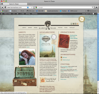
If you’re a new author or a self-published author, you need one. Even JK Rowling and Wilbur Smith have them. But what makes for a good author site?

Above all, the site must provide details about your book(s) and also contain links to retailers for purchasing. However, it’s also to help readers connect with you. The website URL should be YourAuthorName.com and not YourBookTitle.com (unless of course you plan on being a one-hit wonder). Assuming you’re not, the website is your library and forum, so set it up as such.

Websites for authors don’t have to, and probably shouldn’t be, large. You want to write books, not update websites. Navigation tabs at minimum should include:
About – Books – Contact

The optional stuff is where your readers get to interact with you, and that’s crucial in gaining a following. So additional navigation can include things like:
Book Trailers/Video – Press/News – Blog – Photo Gallery – Twitter Feed

Contact info is tricky. Many authors work from home, so listing a phone number and address can feel creepy, especially for the gals. So provide a contact form for readers. Links under your “contact” navigation can include all the social media accounts you have, so readers can connect with you there as well:
E-mail – Facebook – Twitter – Goodreads – RSS Feeds, etc

What other content do you think author sites should have?
Please share examples of author websites with great features or functionality.

When building my author site, I designed it so the Eiffel Tower background behind the middle section can change as new books are released, giving the site a fresh feel and PR functionality, while content stays the same.

Posted in Blog | Comments Off on Author Websites

First Friday: Matt Flowers’ Landscapes

A Matt Flowers Landscape

Imagine a mountain top. Way up high. With old craggy rocks springing forth with glorious evergreens reaching for the sun. The above artwork is part of a collection by Richmond artist, Matt Flowers. But all is not as it appears. It is not a photo of place. It’s a place created by Matt that and your interaction with it makes you feel huge while at the same shrinking you in an Alice in Wonderland kind of way.

Using driftwood, rocks, moss, enamel, paint and detailed hand work that is surely going to give him early-onset crows-feet, Matt is a sculptor of landscapes that are driven by his photographic eye. In taking pictures of Matt’s work for this post, I quickly realized I was not capturing one of the most essential and remarkable elements of his sculptures. Scale. So I included a frame of reference to help you comprehend the size through a series of images.

Using the found elements and adding in tools like magnifying glasses and backlit screens, Matt engages the viewer to discover life-like imaginary worlds. Some of his pieces use antique lenses tucked into handcrafted boxes mounted on vintage tripods to create small dioramas that make the viewer feel as if they’ve dropped into an H.G. Wells-like world where nothing is as it appears. His tiny details create landscapes that upon closer inspection feel larger, giving the viewer a magical glimpse into another place both of this world and of Matt’s imagination.

This gallery of images of his sculptures better explains the work, and for more information visit Matt Flowers’ website.

Posted in Blog | Comments Off on First Friday: Matt Flowers’ Landscapes

Celebrate the Flag


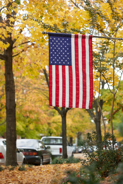
A properly hung American Flag in my neighborhood in Church Hill. Photo courtesy of Worthington Photography located here in Richmond. Worthington-photography.com

I’m a Daughter of the American Revolution (DAR), which means I’ve proven I have an ancestor who fought in the American Revolution. Today, the DAR helps share knowledge about our country’s history, including information about the American flag, which is very appropriate for the upcoming Independence Day celebrations. In case you don’t know, there is an official US Flag Code, and it may alter your July fourth party plans.

The flag should not be put on an article of clothing or anything disposable (paper plates, napkins, etc.). Should you really be wiping BBQ sauce off your face with the flag? It shouldn’t have anything beneath it or touch the ground, so no flag table cloths. If you do hang the flag (stripes down), it should be lit at night if it stays outside and come down during bad weather.

Can you burn a flag? Section 8k states: “When it is in such condition that it is no longer a fitting emblem for display, [it] should be destroyed in a dignified way, preferably by burning.” The Girl Scouts is one of the organizations that performs official retirement ceremonies.

You can read the Flag Code in it entirety, or for a more fun review of wrongful uses go to the Flag Wall of Shame. It’s also a great what-not-to-wear guide.

An interesting note: Betsy Ross didn’t design this flag we have today. Our current flag with the 50 stars was designed by a 17-year old, Robert G. Heft, who in 1958 designed it for a school project. He got a B-minus. When it was chosen out of 1500 entries to be the flag, the teacher changed the grade to an A.

Writing a Brand Positioning Statement (BPS)

Do you think taking the time to properly position your brand is for the birds? Before you hang out a shingle, or write a jingle, brand baby brand.

A couple weeks ago, I met with a group who was struggling over creating a mission statement. Corporate muckety-mucks love them but often I cringe at the cubicle-world, soul-crushing sound of them. I don’t think you can write a mission statement about where you are going without knowing who you are anyways, and that’s why I prefer building a BPS first when I create brands.

What a BPS is not:
• It’s not a tagline.
• It’s not a list of your products or services.
• It’s not long.
• It’s not manifesto for why the CEO is enslaving you.

So what is it? It’s a one-to-two sentence statement that basically sums up the following for your product or your service:
• What you do
• Target audience
• Why are you best/different
• What benefit is provided

Your finished statement has to be:
• Available
• Sustainable
• Defendable

My example is always Nike®. I’m sure their brand statement is not “Just Do It.” It’s probably (I’m guessing here) something like: We make superior quality athletic clothing and sporting equipment so professional and recreational athletes can keep their mind and body on what matters most to them about their game. We let the world play.

Words are chosen carefully. An adjective like “superior” adds a qualifier to “quality.” “Professional and recreational” defines the target audience. The benefit? Every player plays a sport for a different reason, so the “mind” and “body” of each athlete gets to just do it.

Posted in Blog | Comments Off on Writing a Brand Positioning Statement (BPS)

A book trailer for Girl Unmoored

Debut author, Jennifer Gooch Hummer, recently worked with me to build a new book trailer for her YA novel, Girl Unmoored. Her novel has been garnering all kinds of awards (see the list below), and so Jennifer was ready to produce a mini-movie about the book. The trailer needed to give an overview of the story, match her book cover and author website, and also showcase a couple reviews and awards.

To find out more about her story, watch the Girl Unmoored book trailer

To build the trailer, first I read the book! Her main character, Apron, has a funny yet very moving way of viewing the world, so we knew the text had to not only match the book marketing, but Apron’s tone of voice. Working with the artwork and fonts from the book cover, I also added a couple videos and music to help it feel like 1985, the time period of the story.

So today Jennifer launches her new book trailer and announces her collection of fabulous awards. Congratulations!

Jennifer’s awards include:
Cross Genre, National Indie Excellence Book Awards
Best YA Fiction, Paris Book Festival
Best Teenage Fiction, San Francisco Book Festival
YA Fiction, and finalist for Best Cover Design and Chick Lit
Next Generation Indie Book Awards
Finalist for YA Fiction and Best New Fiction, International Book Awards

“Love, loss, and the coming of age of one remarkable girl blaze through this haunting debut like a shooting star you’d wish upon. It’s tough and tender, funny and smart, and it frankly took my breath away. I loved it.”
– Caroline Leavitt, New York Times bestselling author, Pictures of You

“…infused with love and punctuated with wry good humor… Apron may be adrift, but Hummer’s debut is on track.”
– Publishers Weekly


Posted in Press | Comments Off on A book trailer for Girl Unmoored

Expanding a Brand

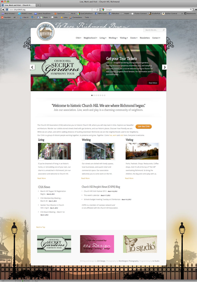
Last week on Compositions, I featured my new Church Hill Association (CHA) and neighborhood brand and website. Today, let’s chat about expanding a brand.

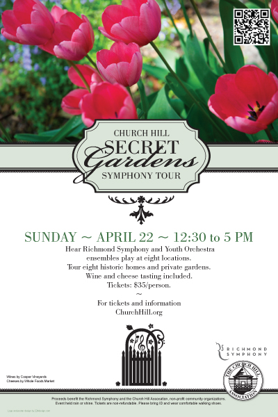
On April 22nd, my neighborhood is hosting a lovely springtime event called the Secret Garden Symphony Tour–visitors can tour private gardens and listen to Richmond Symphony ensembles all over The Hill.  I’ve been helping with the design of materials to support the event. Having just completed the neighborhood brand, I went back to the new CHA brand standards. We have fonts. We have colors. We try to include color photography when possible. So when it came to building the Secret Garden materials, I had only to build an event-specific logo, and then simply apply the graphic standards.

I viewed the  standards not as restrictive, but as a springboard to give me a starting point for the creative for this event. As a result, my probono job was simplified because I wasn’t having to make basic font, color or layout decisions all over again. For Church Hill, the Secret Garden materials look consistent with the CHA website and other collateral, enabling viewers to more easily recognize who we are. They’ll see our brand expanded on our website and now through the collateral for this event collateral: in publications, on banner ads, posters, flyers, tickets, and of course on the CHA site where you can purchase tickets.

As a designer, how do you view brand standards? As a help or a hindrance?

The poster for the event using a percentage of the CHA green, the font Bodoni book, and the CHA logo.

Posted in Blog | Comments Off on Expanding a Brand

Branding a Neighborhood

Building comprehensive brands for organizations is never easy. So imagine doing it pro bono for an entirely volunteer non-profit organization who never had a brand before. Such was the two-year project I recently completed for the Church Hill Association (CHA) with my own neighborhood in Richmond.

The project began with the understanding that a full-blown brand was missing not only for the CHA, but for the neighborhood itself. Church Hill is a very historic, gorgeous neighborhood and we weren’t showing it. It was here that Patrick Henry gave his famous “Liberty or Death” speech in 1775, and Richmond’s first streets appeared. So it felt right to start the brand with the tagline “Where Richmond began.”

From there we developed a brand positioning statement, updated the CHA logo, chose specific colors and fonts, worked with photographers, built communication materials, and most recently completed the website.

Ultimately the main reason for the new website was to give the CHA a place to put all their information–meeting dates, bylaws, programs and events–and ask residents to “Join the CHA.”

The website is now also a major resource for tourists and businesses wanting to come to Church Hill. It provides homeowners with details about caring for historic houses, and provides crucial city and CHA board contacts.

Thank you to Worthington Photography who donated a year’s worth of seasonal images for the gallery, to the volunteer CHA committee who researched and proofed things like crazy, and to Christina Reeser of io studio who programmed the site. You were a gracious and lovely team.

Click to visit the new ChurchHill.org website here.

The Color of Spring

Although Spring has come early this year, I can’t say I’m disappointed. I tire easily of the somber gray and black that seems to saturate my wardrobe and the skies during winter. So bring on spring and all it’s wonderful bloomin’ color.

For designers, spring means that Pantone®, the world-renowned authority on color, is releasing it’s spring color suggestions. While the colors are focused on fashion, they’re also a marvelous tool to help guide graphic designers, product developers and even consumers in their choices. Rather than simply setting a trend, the color guide is more of a reflection of the mood or psychology of society. We’ve been “occupied” under drab tents all winter in a recessed economy, and what the masses are primed and ready for is optimism. So hello “Solar Power” yellow. Spring in “Tangerine Tango” orange. And when all else fails, drown yourself in “Margarita” green. Here is the Pantone Fashion Spring Color Report.

If that’s not enough fun for designers out there, how about this new online tool from Sherwin-Williams. My friend Jennifer (a First Friday artist previously featured on my blog) sent me this link for “Chip It!”  Let’s say you find a photo online that you love? Chip It! and the little program will pull a color palette from from their 1500 paint chips. That’s a handy little tool for picking room paints, but I can think of a multitude of reasons to use it to pick colors for client projects, too.

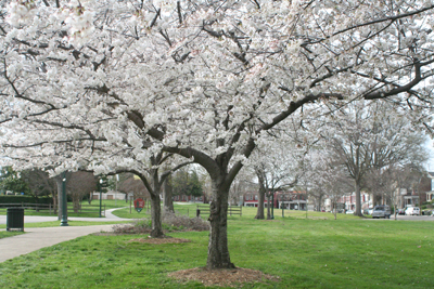
Spring in my neighborhood in Richmond, and the Chip It! color palette made from it. Ironically, it's mostly grey. I'll have to find Pantone 224 pink trees somewhere.

It’s elementary flattery.

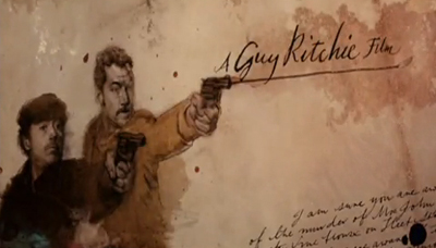
Ah, Sherlock Holmes. I love it. The books, the old movies. I especially love the two new steampunk films. For me, the very sweet eye-candy of both pictures (aside from Downey and Law) includes the care and detail with which the film credits have been developed.

The sequences built by creative director Danny Yount and his team were purely brilliant. They are a cross-pollination of illustration, photography, cinematography, prepress, old type and paper. They all fade in and out from one another like a dream diminishing as you wake into reality.

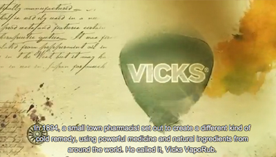
This week, I saw a Vicks commercial that used exactly the same method. Are you kidding me? Those beautiful techniques are now used to kill my cough with honey? I choked. But then I pondered….

Isn’t examining a bit of code or a type treatment, and then adjusting it into your own design the same thing? It’s not plagiarism if you can figure out how a photo treatment was applied and then apply it, is it? That’s imitation. Isn’t imitation the purest form of flattery?

The Merriam-Webster’s definition of flattery is “insincere or excessive praise.” While I don’t think the Vicks spot plagiarized the film’s credits, it was flattery. It was insincere because it swiped a technique instead of creating a commercial that felt like the Vicks brand. It was excessive, because it feels over-the-top for cough syrup. After all, Vicks is not a legend like Holmes, my dear Watson.

Watch the Sherlock Holmes end credits then the Vicks spot and decide for yourself.  To see how Danny’s team did it, if you want to flatter them, too, visit Art of the Title.

A screen capture from the Sherlock Holmes film end credits.
A screen capture from the Vicks commercial.

Posted in Blog | Comments Off on It’s elementary flattery.

© 2024 Karen A. Chase. Collection of data from this website is GDPR compliant, and any information you may have about data collection can be found in our privacy policy.